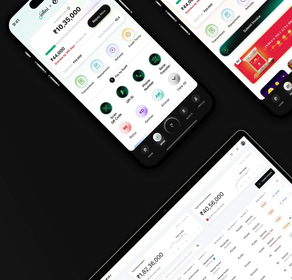
Paisa 2.0 — Rupifi Design System
A token-driven fintech design system rebuilt from Rupifi's original component library into a modern three-tier architecture — primitives → semantic tokens (light + dark) → components.
Brand blue, a green-teal accent, and a coral tertiary, on a soft navy ink instead of pure black.
How this is organized
Three tiers, same as Figma: primitives (raw ramps) → semantic (role-based, light+dark) → components (consume semantic tokens only — never a primitive or a raw hex value).
tokens/generate_tokens.py   ← single source of truth, warns on WCAG AA failures
tokens/css/tokens.css       ← generated CSS custom properties (light + dark)
preview/components.css      ← component styles, tokens only
preview/index.html          ← this page
Usage guidelines
Do
- Use semantic tokens (
surface/*,text/*) — never raw hex or primitives — in components. - Reserve status colors (info / success / warning / error / positive) for their defined meaning only.
- Use
radius/control(8) for buttons and inputs,radius/control-compact(16) for the small button.
Don't
- Don't introduce a second typeface — Inter only, vary by weight.
- Don't use pure black (#000) for text or fills — use the navy neutral ink.
- Don't invent new status hues — extend the existing five-role model.
Color
Three tiers: primitives (raw ramps) → semantic (role-based, light+dark) → components. Status colors carry fixed fintech meaning.
Status roles
Primitive ramps
Semantic — key roles
Typography
Inter, one family across weights Extra Light–Semi Bold. No secondary typeface. Button and control labels use Regular; headings and titles use Semi Bold.
Spacing & Radius
4px base scale. Buttons and inputs use an 8px radius (16px on the small button); cards use radius/container (32); badges stay tight at 6px.
Spacing scale
Radius scale
Buttons
Three-slot layout — leading-edge slot · centerGroup (adjacent icon + label + adjacent icon) · trailing-edge slot — so the label always stays optically centered. Icons inherit the label's color automatically.
Appearance
Icon slots — edge vs. adjacent
Sizes
States
Icon Button
Same appearance and size model, square, icon-only. Icon recolors per appearance/state.
Input / Text Field
Label → field (leading/trailing icon + value) → helper/error text. States: default, focus, filled, error, disabled.
Selection Controls
Checkbox (unchecked/checked/indeterminate), Radio, and Switch — each with an enabled and disabled state.
Badges & Chips
Badge — 8 tones × subtle/solid. Chip — large filter chips (unselected/selected/disabled) and small tag chips with a leading icon instead of a dot.
Badges — subtle
Badges — solid
Filter chips (large)
Tag chips (small)
Feedback
Snackbar — subtle tone background with a solid edge bar. Tooltip — compact dark label with a directional arrow.
Snackbar
Tooltip
Dropdown & OTP
Select — trigger field with label, value/placeholder, and chevron. OTP — 4 and 6 digit entry, with default / focused / filled / error states.
Select
OTP — 4 digit
OTP — 6 digit
List
List Item — leading icon, title + optional subtitle, and trailing chevron. States: default, selected, disabled.
Bottom Sheet
Composed from Button + Icon Button. Used for confirmations, filters, and quick actions.
Dashboard Header
Web app header composed from Input (search) + Icon Button (notifications) + avatar.
Rupifi AI
Gradient mark for AI-assisted features, blending brand blue, accent teal, and coral tertiary in a fluid radial composition. Provided at 4 sizes.